Hello,

my only problem is that Proximus app is confusing as a user of private and business number.
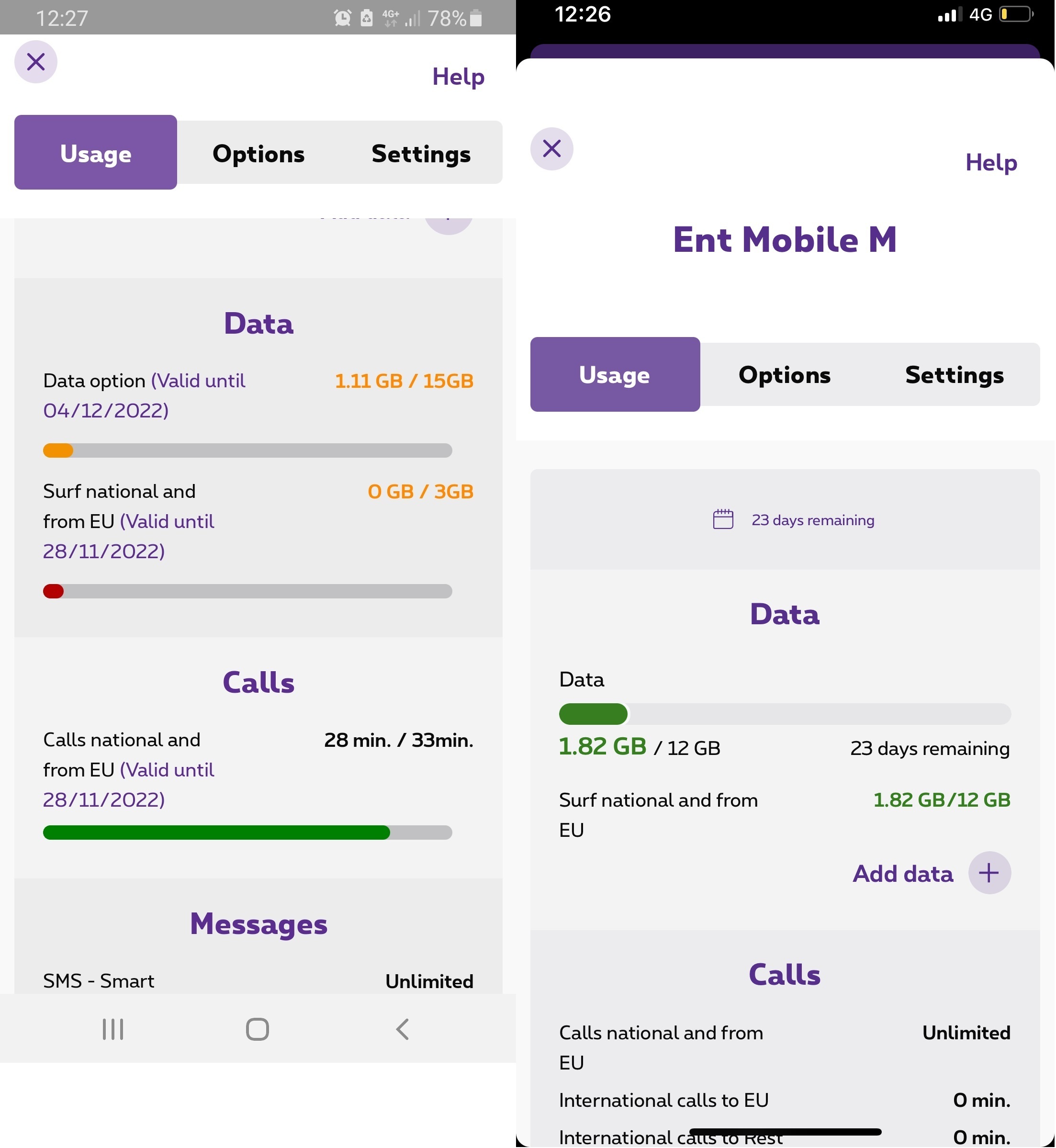
As i use two phones, on the image - Proximus left is private and on right is business. As you can see your developers need to make some changes on showing the consumption of internet in the same way because it is confusing.
How can you have for private users showing what is left of data and for business users what i have consumed of data?
(as it is confusing, a lot of times i got without internet in various awkward situations on the private number)

Thank you.
I hope it will change over time.
)

Hello @lski0 I don't quite understand your remark, besides the color which is different, the bar fills up from left to right and it is well written what has been consumed/what there is in all.. Is that the problem?


Hello, @David W 
I’m not even looking the color (it doesn’t matter in this case), i’m looking how the app shows the consumption of data on two different numbers which should not be the case. As i wrote i will do it again differently.
On the image:
private number (left image): the bar shows what is left of data (the bar as i use data moves on left)
-when everything of data is used the bar will practically disappear
business number (right image): the bar shows what is used data (the bar as i use data moves on right)
-when everything of data is used the bar will be full
Two different ways of showing how much you spend your data, nothing else.


Ok @lski0, thank you for the precision, could you fill in your profile in the "Ticket" field in the order the private number and then the business number please?


Commenter